
Data Collection in a Pandemic: Inside USAFacts’ COVID-19 Tracking
Join us and spread the word to your community
If you’ve been on Countable during the coronavirus (COVID-19) pandemic, you’ve likely seen our post that uses USAFacts’ county-by-county maps to show the most recent public health data near you. Three members of the USAFacts team recently joined us for a conversation about the work they’ve been doing tracking the data, surfacing it for the general public, and providing insights to policymakers on the White House Coronavirus Task Force. Here’s what we learned:
COUNTABLE: Tell us a bit about how USAFacts’ COVID-19 data tracking got started and what the current offerings are.
AAMIR RASHID, PRODUCT MANAGER: With respect to COVID, Tanveer started collecting this data at the county level pretty early on. Before it got unwieldy it was something we were able to do by hand a couple times a day on the county level. Unbeknownst to us and a lot of folks we didn’t realize the scope and scale of how the data effort was going to change, but we immediately did recognize that the value add of doing this as a public service and as an important tool for information for a lot of folks that our data set had become. We invested a lot of time working to build the architecture and infrastructure to process this data on a daily basis. We’ve been doing that since early March.
The realm of government data that we usually live in is related to economics and a lot of other stuff, so the health aspect of this situation is a bit unique to us, but it is still government data nonetheless and it wasn’t divorced from the same challenges that we’ve seen on local and state level government data reporting. So we had the domain knowledge in some sense to start engaging right off the bat and start building the resources we needed to collect that data on a daily basis.
The data set has been used by the CDC, the NIH, and the White House Task Force. We’re trying to add a layer of data to what these other organizations are also working with and hopefully some collation of that data or layering of that data can provide the canonical epidemiological data that underpins this crisis.
TANVEER ALI, DATA VISUALIZATION ANALYST: Previous to this, I used to be a newspaper reporter so I still have a little bit of that role in me where I thought, “We need to do this fast and we need to do this correct.” We heard rumblings that people don’t know what’s going on in their community. This is something that’s been hammered into me that if something’s happening at the national level, it’s probably happening at the local level. Initially, we had this thought process that this would be a little too complicated, but I thought that we could do it.
Little did I know that it would on several occasions take me deep into the night -- when you go from 125 counties to 200 counties to now, where there are just a few hundred counties that don’t have cases. The COVID tracking becomes a little more complicated, but we recognized there was a need to put our full effort into it. Aamir has really led the charge in terms of getting our technical backbone in place. We’ve gathered some graph data, we’ve gathered some table data.
AAMIR: Right now what we’re publishing to everyone is the confirmed case data and the confirmed death data that’s published by local or state agencies. We’re doing this with the CSV on our website. And we also have an API that we have a limited rollout of to partners who have been asking for that, so there are some government organizations using that, some private organizations, and some researchers that are using that.
I’ve also been working on collecting all of the other related data from different localities, such as recovered statistics, testing data, demographic data related to age, race, and gender as it’s available from different states & counties. We haven’t published that yet, but later today Tanveer and I are having a conversation about how we want to incorporate that into our overall data offering and our visualization offering.
TANVEER: Everyone feels like this is one of the biggest things in their lives to witness not only from a health standpoint, but it's going to have a huge impact on society issues and definitely economic issues. All of the members of our team and I are working together to look at the economic impact of COVID looking at various indicators and data sets that are coming out of the White House and agencies at the federal level.
In the long run, we're going to keep an eye on how coronavirus has affected our country, and how long it will take to get back to normal. The details of that are varying right now, but in general we’re focusing on how the economic issues are going right now, how the health issues are going right now, and what will be the overall impact.
SASHA ANDERSON, STRATEGIC PARTNERSHIPS MANAGER: One of the really exciting things that we were doing in contrast to numbers reported by the CDC and other places are doing is publishing our data as a time series. I know that sounds really basic, but not just being able to see what happened today but being able to see trends and the rate of increase. I know people have reached out and were like, “Thank you for having the daily numbers so that we can track this rather than just having what the latest is right now.”
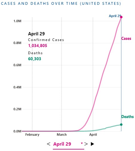
You can adjust USAFacts’ visualizations by date to see how the COVID-19 outbreak has evolved since as far back as January 22, 2020.
COUNTABLE: In terms of the public health data, how much uniformity is there between federal, state, county data?
TANVEER: Initially, everyone had a different way of doing it. There were questions about things like what “confirmed cases” mean, the formats were off, the reporting dates were off. A big part of the struggle early on was just making sure we were comparing the correct data points. As we went along, reporting structures got better and we more or less knew what confirmed cases meant. There are still ongoing issues, like with New York and “probable deaths”. Initially, we weren't sure how to deal with that issue of potentially adding several thousand deaths to the count but we have since decided to include these deaths in our count.
In general, everyone from counties to states to federal agencies has recognized the importance of having consistent data and things have been working better and better lately. I’ll also note that there is a human being putting data in there, so we have had cases where we had to deal with inconsistencies like a county going from 27 cumulative cases to 24 cumulative cases. As a whole, things have gotten a lot more standardized and we hope to continue to see things become standardized a bit further.
AAMIR: We aren’t at this point directly partnering with the other organizations that you might have seen, I think Johns Hopkins is a pretty standard one that a lot of the media reports on. Some people ask, “Why are there multiple sources of this data?” And it really does come down to the fact that there are certain decisions you can make about how you want to report the data that might change the underlying fidelity of that data.
If an organization chooses to report real-time data, for example, a necessary trade-off is the underlying fidelity of that data. Because initially we didn’t have the resources that a lot of these other organizations did, we decided to publish once a day around midnight Pacific Time and 3am Eastern.
And in doing that, sort of serendipitously we realized that our data tended to be a lot more consistent because at that point all of those reallocations that Tanveer mentioned, for example a county going from 27 cumulative cases to 24 cumulative cases, we were able to reconcile those in a more consistent fashion.
Last week, the CDC published a mortality and morbidity report about community mitigation and how that’s affected the spread of the novel coronavirus in a few key communities across the country, and they used our data because it had higher fidelity and was better for that particular epidemiological purpose. What we’re getting a lot from the CDC and the folks at the White House is that when the government is making these decisions, whether it’s deploying PPE or the Army Corps of Engineers setting up these temporary hospitals it’s based on a collation ― this was a month ago so I’m not sure how current this figure is ― but on a collation of six different data sources on the county level. We know that we were one of these data sources, and we were taken to make the presumption that Johns Hopkins was also one of those data sources, I’m not completely aware of what the other ones were. This is a multiple organization effort to provide the best data, some groups will focus on real-time aspect of it, some ― like us at USAFacts ― focus on official reported government numbers. We get emails from people saying, “Hey there’s two deaths in our county but you haven’t posted it on our site.” While we see news reports about those deaths, we choose not to report until the states or the localities report those deaths. That can cause some discrepancies across different areas, but in general every morning we’re easily within 1% of Johns Hopkins’ numbers and that makes sense because there’s not that much of a deviation.
One standard that the government is holding for groups that they are using data from is around 1% of deviation from what they consider the source of truth ― which is the collation of data from multiple data sets. The CDC obviously has information about nearly every single case that gets reported up from local and state health departments. They try to make sure that the data points we report are within 1% in aggregate of their data, and we have the privilege of getting inside feedback from them a couple times a day about quality questions or a back-and-forth about that sort of thing.
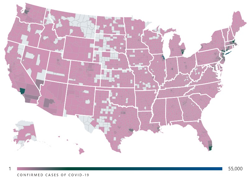
You can see the interactive version of this visualization showing the number of confirmed cases of COVID-19 in each county over at USAFacts.
COUNTABLE: What about territories like Puerto Rico or other non-state entities?
SASHA: It took a little while for territory data to be reported from when we began collecting data, but since it has been we’ve been doing our best to collect every day and we have plans to make it available within our data set for download. Right now, we’re working to rebuild the structure that’s feeding the visuals so we don’t have it shown on the USAFacts platform yet. But we know it’s needed information that should also be published along with the rest of the states, and we’ve been collecting the data and hope to be able to share that soon.
AAMIR: And in addition to that, tribal nations that are reporting data, a lot of them ― especially the bigger tribal nations like the Navajo Nation ― are reporting independent numbers, we think, from the states. So for example, in Arizona we’re getting numbers from the Navajo Nation and we’re getting numbers from the Arizona Dept. of Health, and the process of reconciling those is not immediately evident. In fact, we’ve had a sort of back-and-forth with the federal government about how even they’re trying to figure out how much mutual exclusivity there is between those data sets. There’s a lot of nuance there that people are actively trying to figure out right now and that process is underway, especially for tribal nations.
COUNTABLE: What are some of the other challenges that you’ve faced in tracking this data?
TANVEER: Some states do not report all the data that we’re expecting, per se. We’re trying to match every confirmed case with a county, we’re trying to match every confirmed death with a county. Some states have different policies, different technology infrastructure, whatever it is ― not all states report that equally.
The state of Rhode Island does not report where the deaths have occurred, so overall we have over 100 deaths in Rhode Island that are not attributed to a county. In the state of Kentucky, they had not an interactive map, not a table of all confirmed cases, but a color coded map where you couldn’t determine the exact number of cases in a given county, so we had to do some deduction and go to the county level, but eventually the state of Kentucky got better. In the state of California, the state does not report any rolled up county-level numbers, so we have to go through all individual 58 counties to get the data directly from them.
A lot of the counties are pretty robust in terms of the data they’re reporting even if it’s not the most sophisticated tech set up, so we know exactly where to go. Every state is different and there’s no uniformity there, but there is a move to uniformity and a recognition that it’s important.
COUNTABLE: Why is the data so important for policymaking amid the evolving pandemic and the public’s understanding of it?
AAMIR: I think that at some point, one might have thought that confirmed cases, once they get above a certain point, becomes less relevant. An increase of 10,000 makes a huge difference if there’s only 20,000 cases, but it makes less of a difference in some sense if there’s 750,000 cases like there are today.
But the key thing I think to recognize for everyone is that, in general, states and local health agencies are the ones who are mitigating health crises. Local health departments, a big part of their job is to ensure ― you know, if there’s a West Nile outbreak in a county in the South ― usually their mandate is to focus on community mitigation for these sort of rare occurrences, rare diseases. And this is the first time in recent history that we’ve had a public health emergency that’s on such a nationwide, let alone global, scale. And those small changes actually do matter if you’re looking on a county-by-county level, because that 10,000 increase when there’s 750,000 cases might be in places ― a lot of those might be in areas that are seeing a greater increase in cases in the current moment. So for example, today and yesterday, Kentucky reported a big increase in certain counties. That’s not necessarily reflective of what’s happening in New York State, where it’s plateauing or in some cases decreasing. So while 10,000 might not be a lot of cases overall, it is if a lot of the cases are in places where the infection or disease was not widespread to begin with.
The federal government has taken a large role in mitigating this across the country. Now they don’t have the same visibility that a state or local health department might have, and of course everyone needs more resources. From a policymaking standpoint, the federal government needs to be able to quickly understand where cases are getting worse and there are a lot of great private organizations and federal agencies that are working to deliver that insight. And this is part of that larger effort so that the federal government so that they can focus on deployment of resources, figuring out where more tests need to be conducted, figuring out how community mitigation strategies are slowing the spread of this disease. So from a policy standpoint, I think this comes down to the fact that we need granular insights across the country and confirmed cases and deaths ― while the most superficial statistic in some sense ― are actually the most important to know right off the bat.
COUNTABLE: Thank you all so much for your time, is there anything else about USAFacts’ data efforts you’d like to share?
AAMIR: From a broader USAFacts standpoint, our mission and our goal has always been to make government data more accessible. I don’t know if we had sort of envisioned in our five-year history that it would be in this way. This happens to be a really critical moment in time, and that’s what’s surfacing the USAFacts effort in particular.
But this issue isn’t just constrained to public health problems and emergencies. This issue exists consistently across the board with a lot of government data as it’s rolled up to the federal level. A lot of this data we can only get from agencies like the Centers for Medicare and Medicaid Services once a year, because they take about that long to collect that data.
The import of having this information in real time and immediately is becoming more and more evident because you can’t be agile in a response, especially a nationwide response, without having access to this information. Because there’s no centralized government effort to do this, that’s the whole reason USAFacts exists ― it’s to make sure that this data is available to the everyday person but also to people who are making policy decisions.
SASHA: That’s really well said, and I would just add to that, just as an example in this current case, that the folks that we’ve had reaching out to us looking for this data and the planning that they’re doing is vital. From companies that are looking to see where to close offices to protect their employees, to non-profits that know that they can help want to figure out where to step in and deploy resources. And it’s something that doesn’t exist and wouldn’t have existed from the government because the infrastructure isn’t there to support it so private entities like USAFacts have had to step in and report it to make sure it’s available. This situation was unexpected so it’s unsurprising that the technical infrastructure wasn’t there to report specifically on coronavirus data but there can be efforts made to scale up data reporting infrastructure for the future, whether it’s another pandemic or something else.
― Eric Revell
(Photo Credit: USAFacts Coronavirus Resource Hub)
The Latest
-
 SCOTUS Hears Trump Immunity Case, Appearing SkepticalUpdated Apr. 26, 2024, 11:00 a.m. EST The Supreme Court heard oral arguments today over whether Trump is immune from prosecution read more... States
 -
 IT: 🖋️ Biden signs a bill approving military aid and creating hurdles TikTok, and... Should the U.S. call for a ceasefire?Welcome to Thursday, April 25th, readers near and far... Biden signed a bill that approved aid for Ukraine, Israel, and Taiwan, read more...
 -
 Biden Signs Ukraine, Israel, Taiwan Aid, and TikTok BillWhat’s the story? President Joe Biden signed a bill that approved aid for Ukraine, Israel, and Taiwan, which could lead to a ban read more... Taiwan
 -
 Protests Grow Nationwide as Students Demand Divestment From IsraelUpdated Apr. 23, 2024, 11:00 a.m. EST Protests are growing on college campuses across the country, inspired by the read more... Advocacy
 Climate & Consumption
 Health & Hunger
 Politics & Policy
 Safety & Security
